Second assignment for this week was to create pattern, at the same time to show some examples of the usage of colours, to choose either one colour and degrade it into few different tones or choose 2 colours for example blue and yellow and try to have different tones and get mixtures of the two colours i.e. green in the middle of it.
As for me, I chose the first option as I did this exercise before with my serial planes. Wanna check them out? Click
here.
Thinking of this pattern, I came out few things that I want to include in this pattern design. So first, I came out with the theme which is graduation. It's graduation week so it's inevitable to see people with robes everywhere. Literally.
Thus, I decided on purple. One, because it's KAED's colour and two, because it's S's favourite colour.
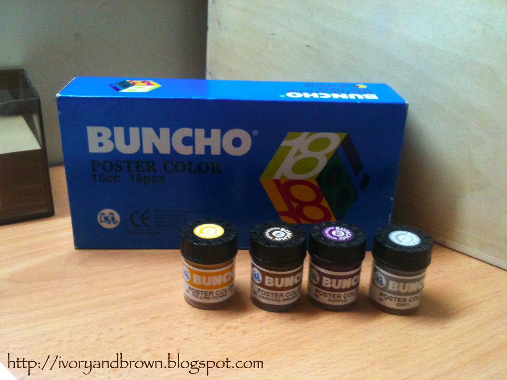
Plus, I have 3 extra Buncho poster colours - leftover from my serial planes project, so...
Then, I started to think which pattern fits the most. I chose IIUM's logo for a start and I just went on from there.
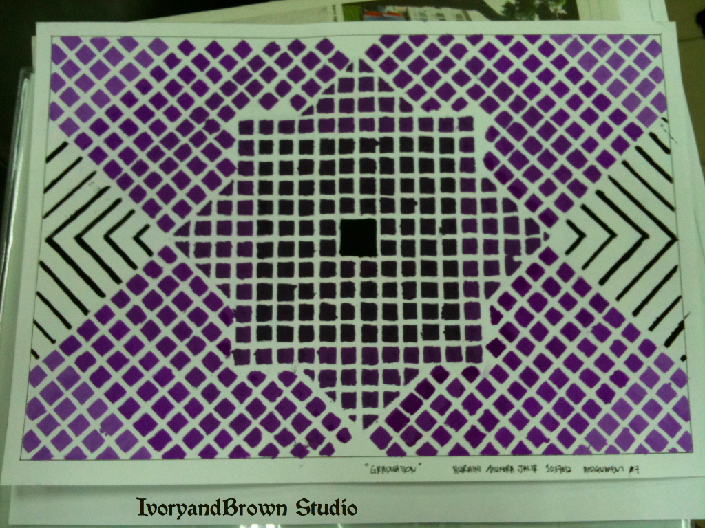
So, this is it. Might seemed a little bit messy but it's okay as those purple squares represent us, the students.. None of us perfect, so here it goes..
 |
| Assignment #7 |
As you guys see in the picture above, there are 5 tones i.e. I degraded an upgraded (is it the right term..?) by mixing the purple colour with white and black. For purple and white mixtures, I did 3 tones (the ones outside the IIUM logo), as it represent the Architecture students from Year One to Year 3 (Part I - Bachelor of Science in Architecture) and for the purple and black mixtures, I did 2 tones as it represent the Architecture students from Year 4 and Year 5 (Part II - Bachelor of Architecture), and comes the black square in the middle shape like the trencher or in American, mortarboard or simply the graduation hat, representing the graduation or convocation itself.
Other elements in the pattern, such as repetition where the squares are repeating, covering 95% of the design, and focus as the pattern is heading towards the same direction.
Took me one whole day to conceptualize the pattern, deciding on the colour and everything and took me the whole night to finish up the colouring process. Well, thanks to the 1cm x 1cm squares...
I was so excited while presenting this in front of the class as designing pattern is something that I do all the time. Thanks to COLOURlovers.com ...
I think that's all about this assignment. Feel free to drop some comments, kay!
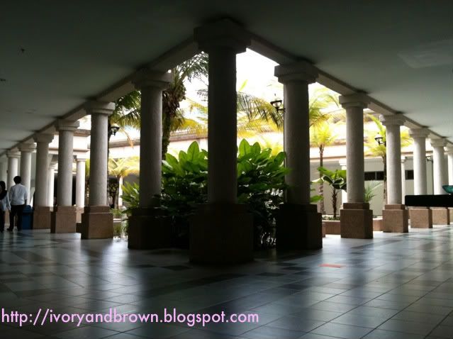
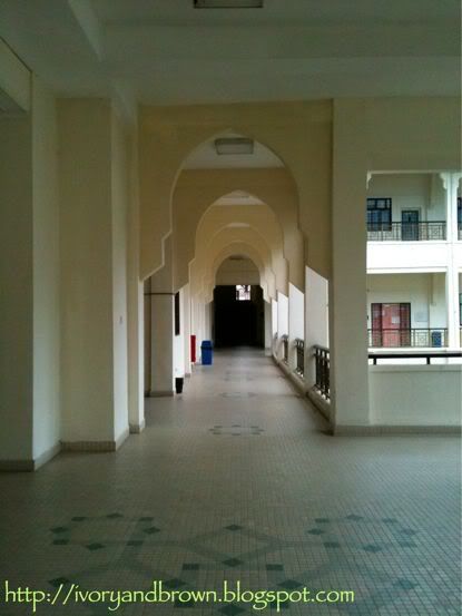
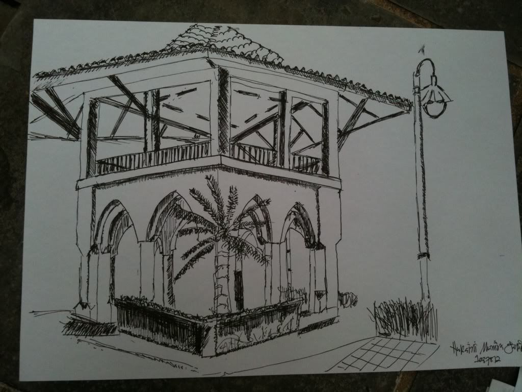
As for today, we learned about one-perspective drawing and as for the assignment, we are required to find a place and draw the one-perspective view.
This one is linear-perspective so it's kinda easy to find one but the challenge is, we need to colour it. Hmm...
Still considering what medium I'm going to use this time... Most probably, I'll go with water colours pencils.
Alright, peeps! It's time for lunch. Au revoir!
E
